
Power Station or PlayStation? How Sony’s Console Shifted the Gaming Landscape
I recently found some early 'PlayStation' designs. Here’s what stood out to me


I recently came across a series of images that show the original PlayStation in an entirely different light.
Their origins unknown; the images are low-resolution with some details being hard to make out, but I’m glad they exist. They highlight just how easily Sony could have taken a very different path.
It underscores that the PlayStation was anything but guaranteed, shaped by rough designs, alternative names, and the risks a usually cautious Sony had to embrace in the early 90s.
In my mind, I imagine that each design iteration reflects the simmering tensions between engineers and executives. Something that Kutaragi has stated, suggesting the entire PlayStation project was in jeopardy due to a lack of internal understanding.
Prototyping isn’t new, of course, but in the context of the PlayStation, it offers a rare glimpse into a world that might otherwise have been forgotten. A rare glimpse into a process that sorely lacks any documentation or artifacts, in my opinion.
So the PlayStation journey was far from a smooth one. There were missteps, scrapped ideas, and near misses, many of which will forever remain anonymous.
But for the ideas that don't remain anonymous, this is the story of what might have been—and why it inevitably wasn’t.
The Power Station That Almost Was
During prototyping, rough designs are often thrown together as a quick and dirty way to test everything from thermal performance to aesthetics. The creation of the PlayStation was no exception to this.
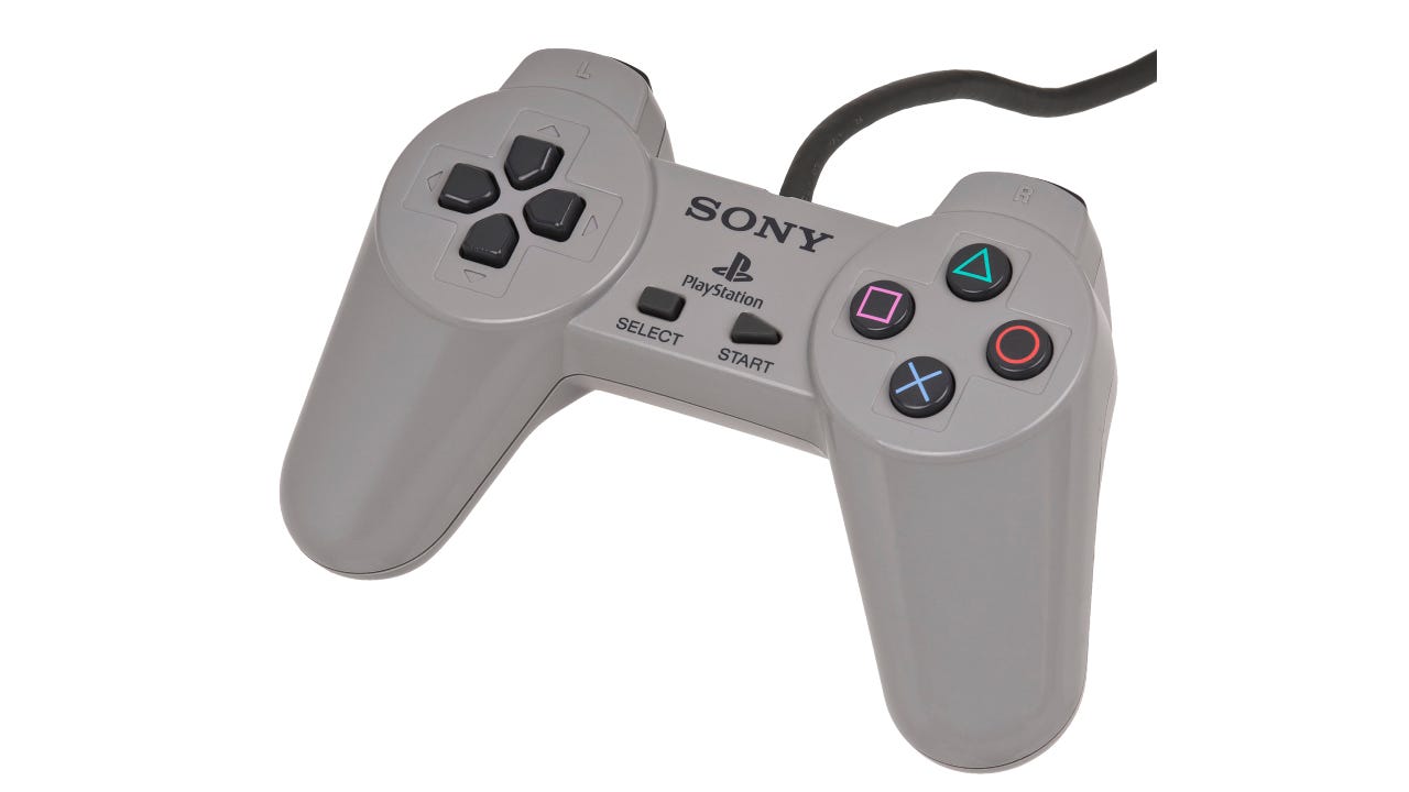
In fact, rather famously, it's the PlayStation controller which demonstrates the line of thinking during early-stage PlayStation.

Just look at how many there are. It’s insane!
One prototype featured a circular pad with buttons arranged around the edge, a design that might have looked futuristic but was almost impossible to use comfortably. Another experimented with trackballs, an idea that felt more at home on an arcade cabinet than a home console.
Version after version, playtest after playtest, the controller evolved then evolved some more, before it eventually landed on that iconic design we all know and love.
Well, at least until the analog and Dual Shock controller came along.
What if Sony had launched one of those early prototypes instead? Would gamers have gone for the unusual design, or would the awkward shape have put them off completely?
Perhaps this shows how Sony took an idea, gathered up feedback, and improved upon it. A trait likely shaped by their years of building hardware in other areas.
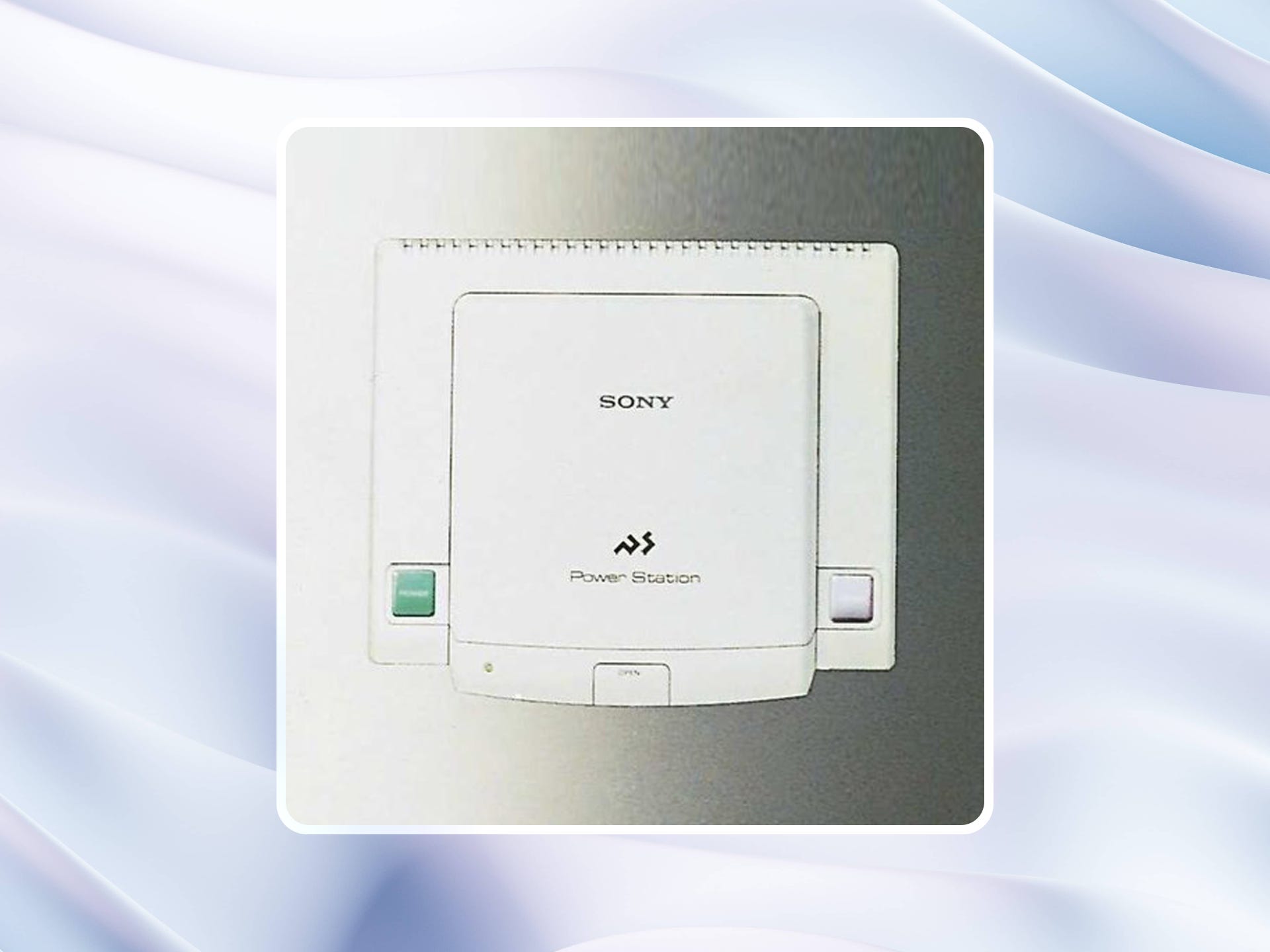
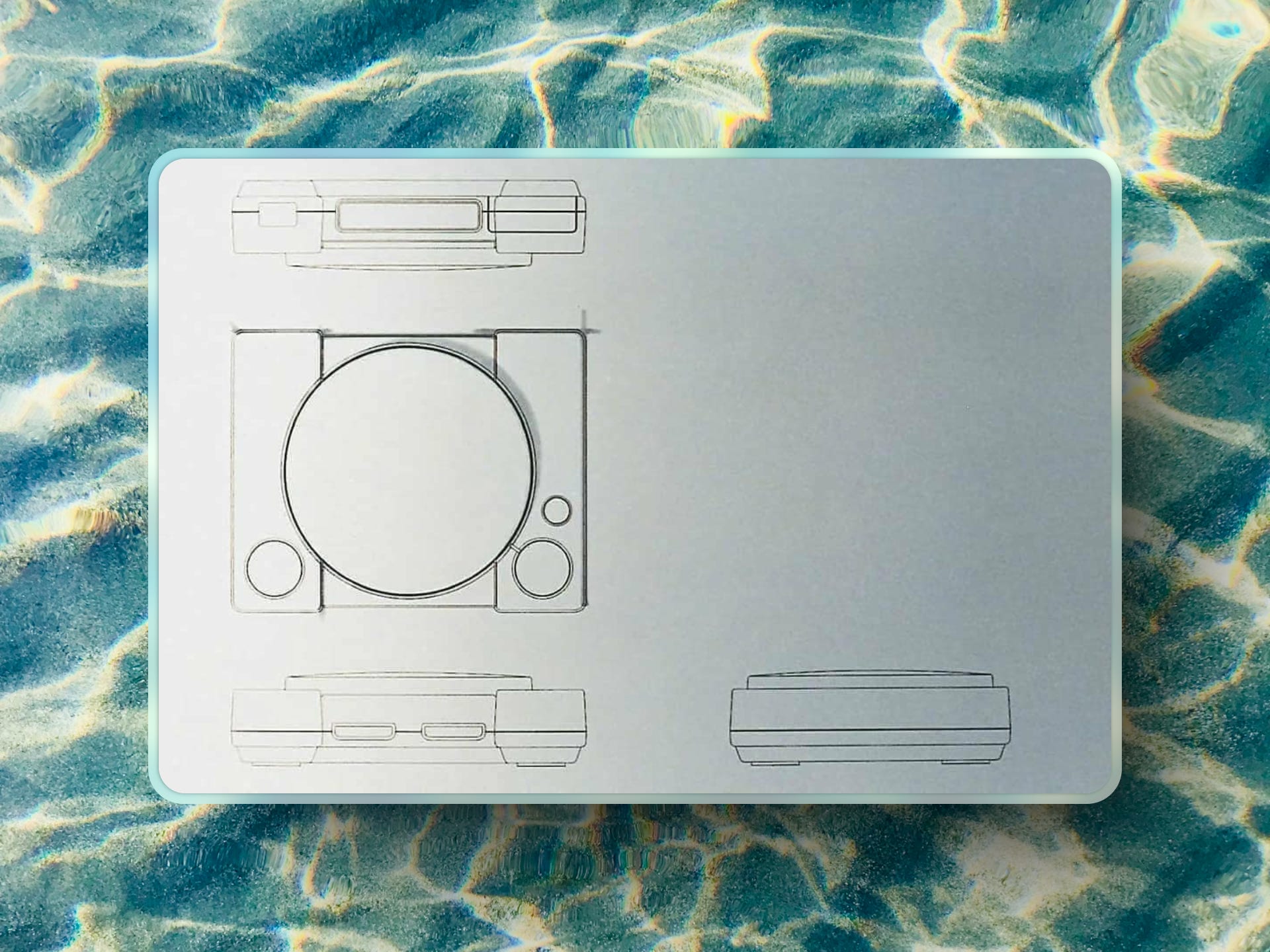
But let's talk about that boxy slab with the name "Power Station" slapped on it. You'll have noticed it front and center as the featured image for this piece, and it's incredible to think about what could have been.
Some rumors even suggest detachable parts, focusing on modularity and customization. These rumors are unfounded, as there's nothing to suggest from the image below that there'd be any sort of modularity.
Too risky, too expensive, too complicated for Sony's first foray into home gaming. But it’s fun to think about. It’s hypothetical chit-chat.
A lot of what we discuss here is limited by a lack of concrete information, which I guess is typical of a pre-internet console launch—though it is fascinating to talk about these hypotheticals, even if those hypotheticals are based on speculation and rumor.
But what about that name, Power Station?
Well, apparently, early in development, Sony considered this as the console’s branding, reflecting a focus on "power and utility". Something with a degree of then typical machismo and flare no doubt.
It’s easy to see what they were aiming for—this was the early 90s, and tech products often leaned into terms that evoked strength and capability. Think Megadrive, Vectrex, Roland Jupiter, and Discman.
There was a clear trend of products leaning into subtle signs of masculinity to broaden their appeal. It’s nonsense, of course, but there’s plenty of evidence that shows that’s how things were back then.
90s or not, there was a problem: Power Station lacked any sense of fun, creativity, or playfulness. Really, what does Power Station mean? What images convey in the minds of gamers when they hear that?
More importantly, would people who aren't gamers engage with it?
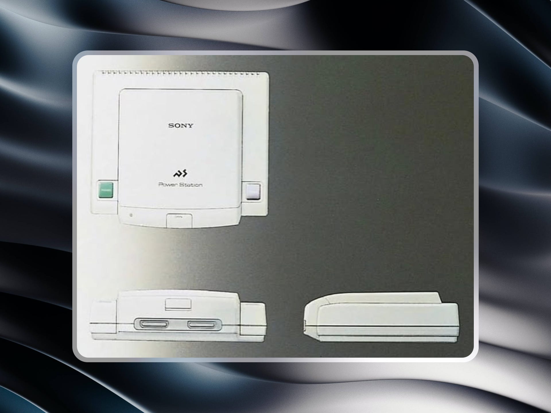
In terms of the form factor of this particular variant, it would be fair to say that it's not a million miles away from what was eventually released.
The most fascinating aspect is that Sony regarded the top-loading design as superior to a slot loader, making it clear that a lid was always destined to be a defining feature of the PlayStation.
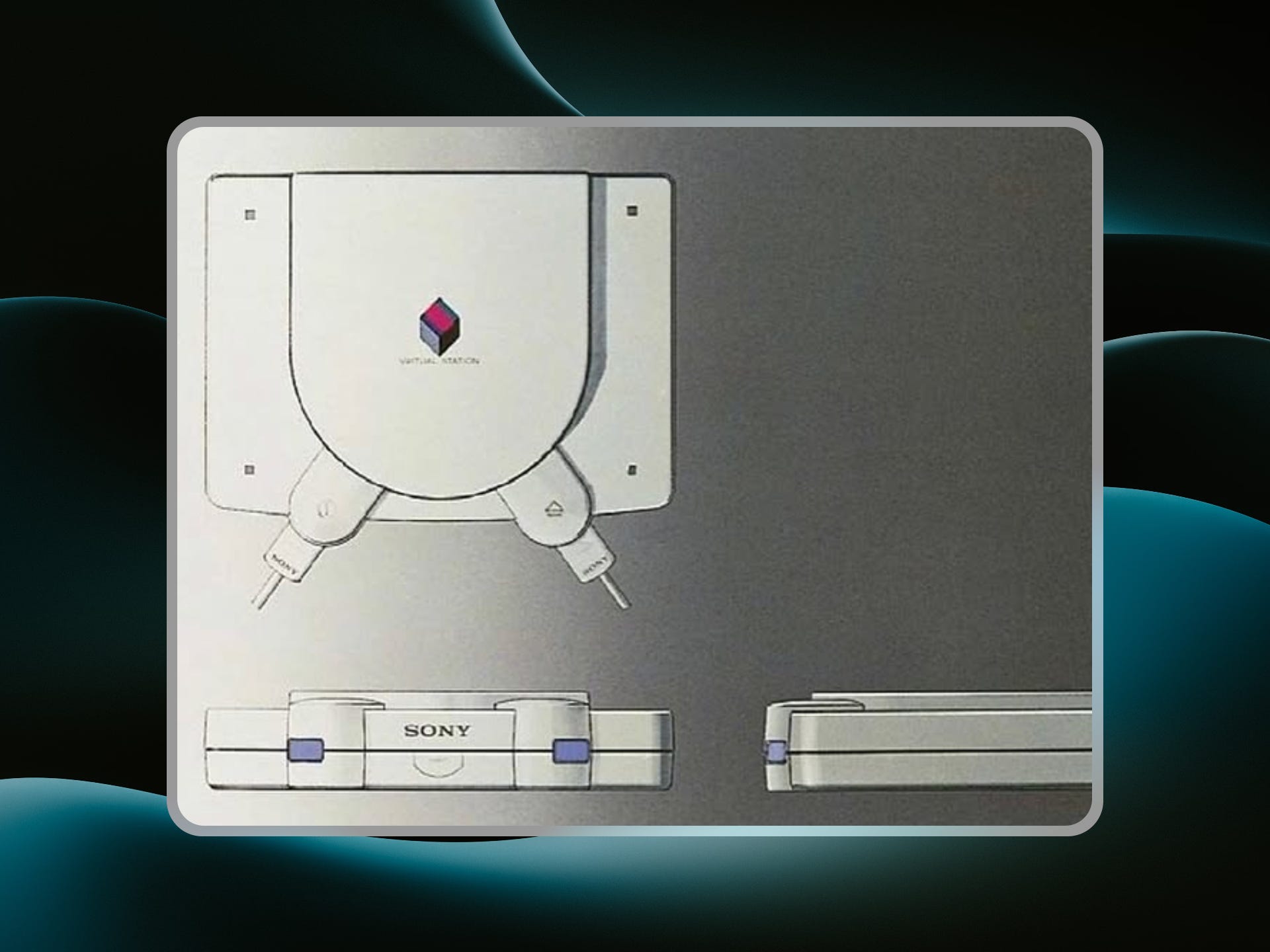
Another variant, the Virtual Station, looked more like a piece of professional audio equipment than a gaming device, with harsh lines and a bulky profile.
Probably for the best Sony passed on that name. It would’ve felt dated before the first units even hit shelves.
So what about Virtual Station?
The name conjures up images of clunky tech from a bygone era, especially in a decade where sleek, portable gadgets like the Walkman and Discman were redefining consumer electronics.
These designs may have looked innovative on paper, but they lacked the simplicity and elegance that the PlayStation would eventually be known for. Still, they served a purpose.
Each one was a stepping stone—an iteration that helped Sony figure out what worked and what didn’t. Without those early experiments, the final design might never have come together as cleanly as it did.
I’m glad these exist. I’m glad we got to see them.
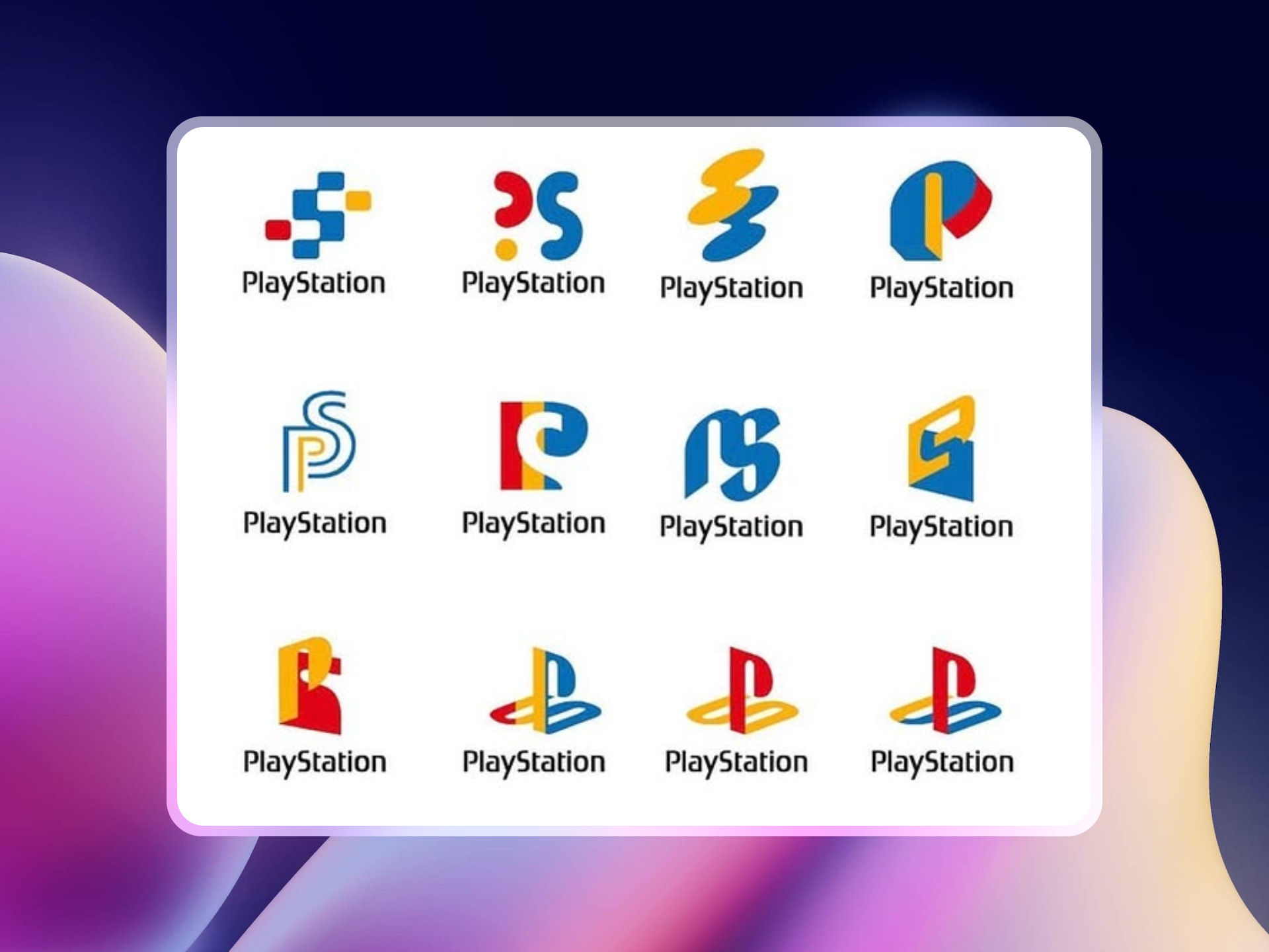
Logo Experiments
We've written about Sony's logo iteration before.
Even the PlayStation’s logo went through its own journey. Early drafts included jagged, overly complex designs that felt aggressive and corporate.
One version leaned heavily on metallic gradients, evoking a sense of cold professionalism rather than fun.
The final logo, with its simple “P” and “S” intertwined in bold, primary colors, was a masterstroke.
Designed by Manabu Sakamoto, it balanced simplicity with memorability, becoming one of the most recognizable logos in gaming history. But had Sony chosen one of the earlier, busier designs, it’s possible the console’s branding would have felt more intimidating than inviting.
Let’s imagine an alternate reality where the “Power Station” was released. The console’s bulkier design and modular components might have been marketed as a technological marvel, appealing to tech enthusiasts and hobbyists.
But would it have resonated with teenagers and young adults looking for 3-D polygonal entertainment? I’m not sure. I think there was a risk we’d end up with a much more expensive console, something akin to the 3DO.
The name itself might have been a bigger problem. “Power Station” evokes images of utility and machinery—great for an industrial tool, but not for a gaming console.
Would it have had the same cultural pull as “PlayStation,” a name that feels fun, futuristic, and universally appealing?
Maybe I’m saying this now with the benefit of retrospect.
Even the controller could have derailed the console’s success. If Sony had released a clunky, experimental controller, it might have alienated gamers accustomed to the simplicity of Nintendo and Sega’s designs.
Had all these factors come together, the Power Station might have been little more than a footnote in gaming history, overshadowed by Nintendo and Sega’s more polished offerings.
While it seems ridiculous to suggest this, in my opinion, going with the name Power Station highlights a lack of creative cohesiveness that would have bled into other decisions.
So, PlayStation it was. And the name—along with everything it stood for—helped shape the decisions that followed, all in service of delivering something better for gamers everywhere.
 : r/playstation")
Why the PlayStation Worked
The PlayStation didn’t succeed because it was perfect from day one—it succeeded because Sony made the right calls when it mattered. Some might say they lost that touch by the time the PlayStation 3 came out.
They abandoned clunky prototypes in favor of a sleek, minimalist design. They scrapped uninspired names and embraced one that promised creativity and fun. And they focused on creating an experience that was as intuitive as it was revolutionary.
By the time the PlayStation launched in 1994, it felt like the future.
CDs were a legitimate replacement for cartridges, opening up new possibilities for developers. The controller was comfortable and intuitive, inviting gamers to play longer and explore more complex worlds.
The branding and marketing were bold, edgy, and perfectly in tune with 90s youth culture.
None of this was inevitable. The PlayStation’s success was the result of countless decisions—some bold, some cautious, and many made only after earlier ideas had failed.
The PlayStation’s journey from concept to icon is a testament to the power of iteration and the importance of knowing when to pivot. It’s easy to look at the final product and assume it was always destined for greatness, but the reality is far more complex.
Sony could have released the “Power Station,” a console that might have been technically impressive but culturally forgettable. Instead, they created the PlayStation—a console that wasn’t just a product, but a revolution.
The road not taken reminds us of the fragility of success. Sometimes, the difference between a phenomenon and a failure is as simple as the right name, the right design, and the right moment.